


How many times have you watched a PowerPoint presentation – maybe even on something you were interested in – and wanted to run screaming from the room? If you’re like most people, your answer is “PLENTY of times.”
We’ve all been subjected to these hard-to-watch presentations: Walls of text, distracting graphics, presenters reading slides to us, etc. So why do we keep doing it? Why do poor PowerPoint presentations seem to be a way of life? WHY?
Well, folks, it’s time for a PowerPoint revolution. It’s time for a world where PowerPoint presentations for learning and development are filled with engaging content. A world where speakers use PowerPoint presentations to enhance learning, and not as a handout at the end that you just wish they’d given you in the first place and let you go home. It’s time for a new PowerPoint world.
Related: How to Design Your PowerPoint Slides Like a Pro Webinar Replay
You may say I’m a dreamer, but I’m not the only one. So first, let’s take a step back.

 Or, in this case, a picture contains a thousand words. This U.S. Military slide has become somewhat famous, and for good reason. How could anyone pay attention to the presenter when they’re trying to decipher this photo?
Simple graphics win the day. Easy colors – think earth tones – that don’t distract. Pie charts. Bar charts. Call me dull, but I use a lot of simple bullet-pointed lists with short bullets – and no one ever screams, “Where are all the graphics, man!?” at the end of my presentations.
And here’s an important extra: If you use something funny, like a cartoon, get it off the screen once it plays. I’m sure you’re a great presenter, but you simply cannot compete with a cute kitten or a Dilbert cartoon. As long as it’s up there, they won’t hear a word you say.
Or, in this case, a picture contains a thousand words. This U.S. Military slide has become somewhat famous, and for good reason. How could anyone pay attention to the presenter when they’re trying to decipher this photo?
Simple graphics win the day. Easy colors – think earth tones – that don’t distract. Pie charts. Bar charts. Call me dull, but I use a lot of simple bullet-pointed lists with short bullets – and no one ever screams, “Where are all the graphics, man!?” at the end of my presentations.
And here’s an important extra: If you use something funny, like a cartoon, get it off the screen once it plays. I’m sure you’re a great presenter, but you simply cannot compete with a cute kitten or a Dilbert cartoon. As long as it’s up there, they won’t hear a word you say.
What is the Purpose of PowerPoint?
Before getting into the specifics, I think it’s wise that we take a moment to get back to basics. What the heck is a PowerPoint for, anyway? A PowerPoint is an aid to a presentation. It is NOT the actual presentation! We seem to think that if we don’t have it spelled out in writing on a slide somewhere, it’s not part of the training. But of course, we really know there are multiple ways to get our points across. So, I’m going to lay down a couple of ground rules. A good PowerPoint:- Enhances learning with stimulating visuals and relatable examples
- Keeps the audience focused on YOU, the presenter
- Allows you to remain focused on the audience
Tip #1: Minimize Text
When it comes to PowerPoint text, less is more. Always.- Fewer lines per slide
- Fewer words per line
- Try to keep text to a six-line maximum per slide. If you need more than six lines, have a really good reason.
- Look carefully at each line and see if you can remove any words. In most cases, at a minimum, you can lose the articles. “Using your left hand, pull down on the lever” becomes “Pull lever with left hand.”
- Be sure your text is large enough to be read easily from afar. Don’t cheat by using five-point font to keep it to six lines of text!
Tip #2: Simplify Your Graphics
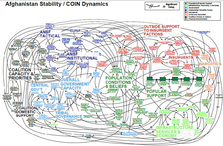
Sometimes a picture is worth a thousand words: Or, in this case, a picture contains a thousand words. This U.S. Military slide has become somewhat famous, and for good reason. How could anyone pay attention to the presenter when they’re trying to decipher this photo?
Simple graphics win the day. Easy colors – think earth tones – that don’t distract. Pie charts. Bar charts. Call me dull, but I use a lot of simple bullet-pointed lists with short bullets – and no one ever screams, “Where are all the graphics, man!?” at the end of my presentations.
And here’s an important extra: If you use something funny, like a cartoon, get it off the screen once it plays. I’m sure you’re a great presenter, but you simply cannot compete with a cute kitten or a Dilbert cartoon. As long as it’s up there, they won’t hear a word you say.
Or, in this case, a picture contains a thousand words. This U.S. Military slide has become somewhat famous, and for good reason. How could anyone pay attention to the presenter when they’re trying to decipher this photo?
Simple graphics win the day. Easy colors – think earth tones – that don’t distract. Pie charts. Bar charts. Call me dull, but I use a lot of simple bullet-pointed lists with short bullets – and no one ever screams, “Where are all the graphics, man!?” at the end of my presentations.
And here’s an important extra: If you use something funny, like a cartoon, get it off the screen once it plays. I’m sure you’re a great presenter, but you simply cannot compete with a cute kitten or a Dilbert cartoon. As long as it’s up there, they won’t hear a word you say.